Discussion
Pegasystems Inc.
US
Last activity: 24 Jun 2019 16:43 EDT
How to make a card with a click action accessible
While reading this recent article called ‘Converting divs into accessible pseudo-buttons‘ from Jamie Nicholls https://benfrain.com/converting-divs-into-accessible-pseudo-buttons/, I realized that Pega developers might stumbled into a similar issue using the out of the box Pega UI.
Making the UI accessible is something that is easily achievable with Pega UI if you know how to correctly configure the control but is an aspect that is sometimes overlooked.
While there is no point of generating a button using a DIV tag, it is very common to expose a thumbnail of ‘cards’ or ’tiles’ on the UI and configure the whole card to be clickable (for example open a modal dialog on click of the card).
If the card only contains an icon and a label, the recommendation is of course to use a button control and some helper classes to achieve the required design. But in most of the cases, the tile/card is more complex and needs to be built using a dynamic layout.
Let’s look at the ‘shopping card’ example in the UI gallery

Inside each card, the book title is a link that opens a modal dialog with more details about the book. What if we wanted to make the card ‘clickable’ instead of using a link? The easiest approach would be to move the ‘show local action’ directly onto the section that in included in the repeating dynamic layout

While you will get the desired outcome, you will face several accessibility issues:
- There is no hover on the tile and it is difficult for a user to understand that the tile is ‘clickable’
- There is no focus style and the tile is not focusable using the tab key
To address these issues, you should wrap the section that contains the card with Image template into a dynamic layout that has the correct aria role selected. This would mean
1/ Resave the section 'pxUIGalleryShoppingCart' into your application rule and point the inner section used for the RDL to a new section called ‘ShoppingCardSelectable’

2/ the ‘ShoppingCardSelectable’ section rule is using a single dynamic layout set to ‘inline’ with all spaces removed and includes a single section called 'pxUIGalleryShoppingItem' that is using the card with image template
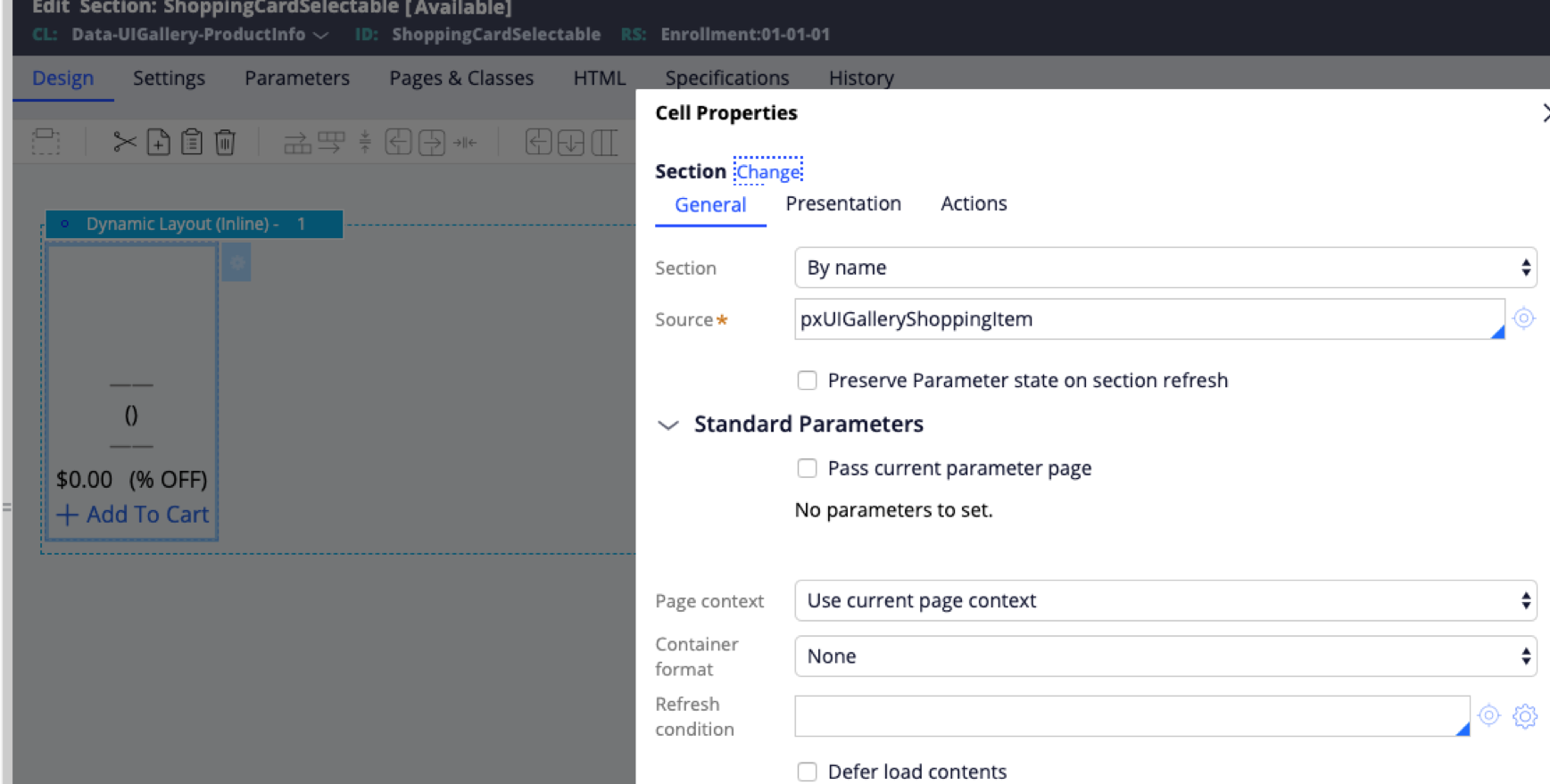 3/ Inside the 'General' tab - set the dynamic layout accessibility role to ‘Component/Widget’ and the type ‘Button’

After these changes, the card is now selectable using the tab key

And has the correct role applied to the div as well as the tabindex is set to 0 like described by Jamie’s article

after these changes, voiceOver will now correctly read the card as a button

The last think to improve would be to provide a better style for focus and hover.
This can be easily done by editing the file py-uigallery-override.css and adding the following selectors:
/* Add hover and focus style for layout that have actions */
.layout .has-action[data-click]:hover,
.layout .has-action[data-click]:focus,
.layout .has-action[data-click]:active {
  outline: 1px solid #CCC;
}
You will then get the following outcome:
