Mobile Client: Part 2, Design and implementation for mobile app content
Scenario
Platform: Pega Cloud 8.4.2, Pega Customer Service, Pega Mobile Client 8.5.x
A Pega CRM/CS application requires a mobile version of its Employee Portal which allows employees to create and monitor internal service requests. Access is online only and SSO is used for authentication.
Solution
As mention in Part 1 using Pega Mobile Client both iOS and Android mobile apps were built and distributed to end users.
The Mobile interface rule in Fig. 1 resulted in the 5 menu items and corresponding mobile screens shown in Fig. 2. (My Drafts is similar to a single tab of My Requests so is not shown here.) Recall the Mobile interface rule automatically creates a Navigation as Fig. 3 illustrates.
When adding a Navigation item via Mobile interface currently 3 options for are availale also indicated in Fig.1.
- Mobile list pages are created for each case type representing a summary report of the case type.
- Actions give you Navigation items representing OOTB case actions like Create Case, Get Next Work.
- Pages offer the most flexibility in creating mobile screens as they are harness rules which allow one to essentially create unique portals for each Navigation item.
For CMS mobile only Pages were used. For this discussion, My Requests, will be used for illustration purposes as it was the most complicated and the same pattern was applied to all other mobile screens. To create a mobile page that can be added as a Navigation item, a harness rule needs to be created under your Org-Div-CMS-UIPages class heirarchy and marked as a relevant record. Pages can(should) also be created via App Studio which will automatically give them the correct applies-to class and mark them as relevant.
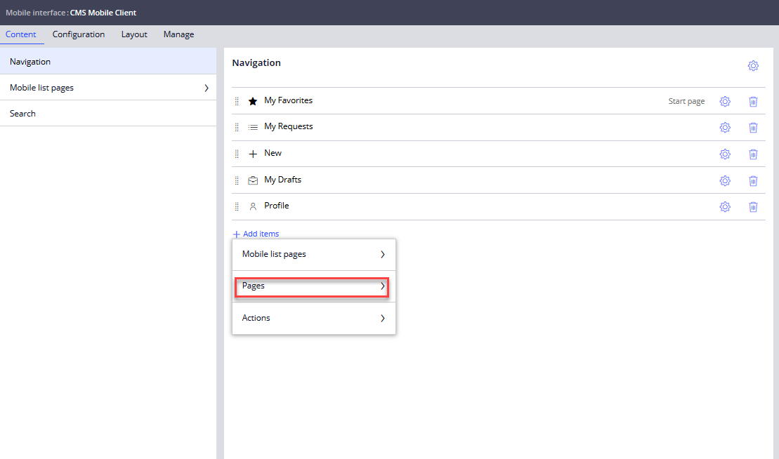
Figure 1: CMS Mobile Interface rule
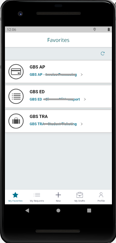
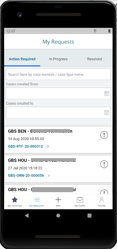
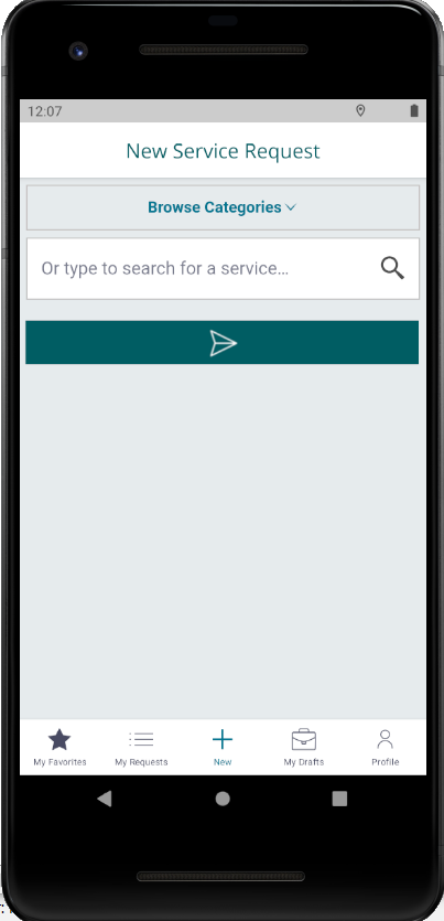
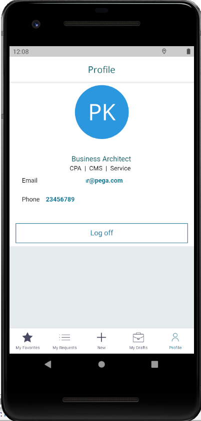
Figure 2: Mobile Screens for CMS app

Figure 3: CMS Mobile Navigation rule
After a fair amount trial and error the correct harness rule design was found for the CMS application. In the end it turned out to simply be what the OOTB User profile navigation item uses. (When a Mobile interface is created a menu item called User profile is added which launches the pyUserDashboard harness.) Fig. 4 illustrates the rules used to achieve My Requests based on the pattern of pyUserDashboard.
4.1 Harness rule launched by My Request mobile navigation item.
4.2 Uses Header Screen layout
4.3 MyRequestHeader section configured for Header Panel
4.4 MyRequestContent section configured for Content Panel
4.5 MyRequestHeader section which is a modified copy of pyUserDashboard reusing just the pyIsMobile sections
4.6 and 4.7 The MyRequestMobileHeader which control header text and format for the top portion of My Requests header in mobile screen of Fig. 2.
4.8 MyRequestsContent uses Mobile tab layout goup. The embedded sections for each tab are shared section with main employee portal.
In short the CMS mobile app is like 5 individual portals to the main application and reuses the same content from desktop version. Some logic was added on sections to switch for mobile vs desktop but only when responsive UI formattnig was not sufficient or different logic was required for desired mobile functionality.
This concludes the second part of the series!
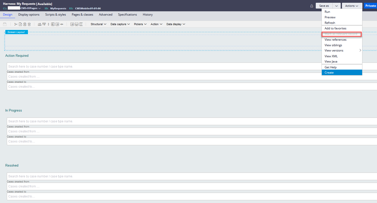
Figure 4.1
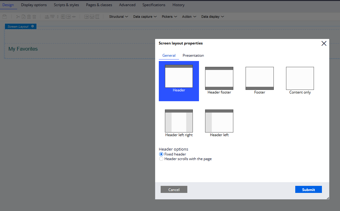
Figure 4.2
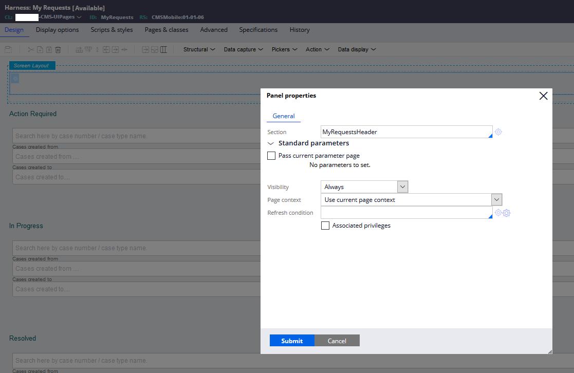
Figure 4.3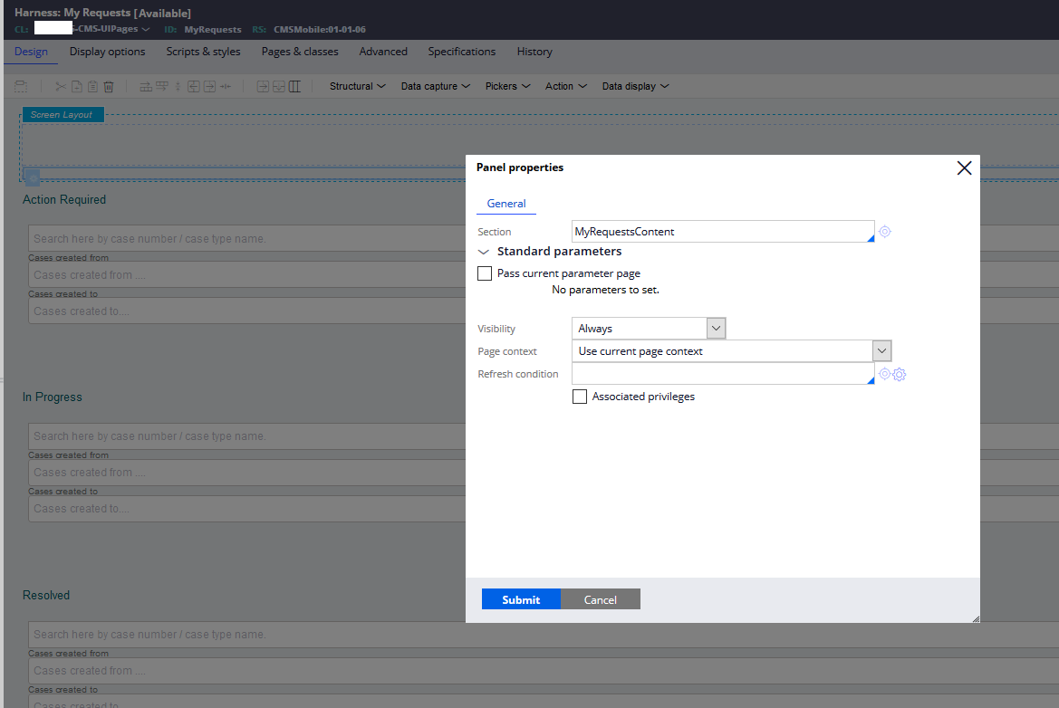
Figure 4.4
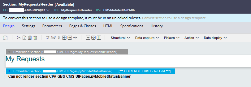
Figure 4.5
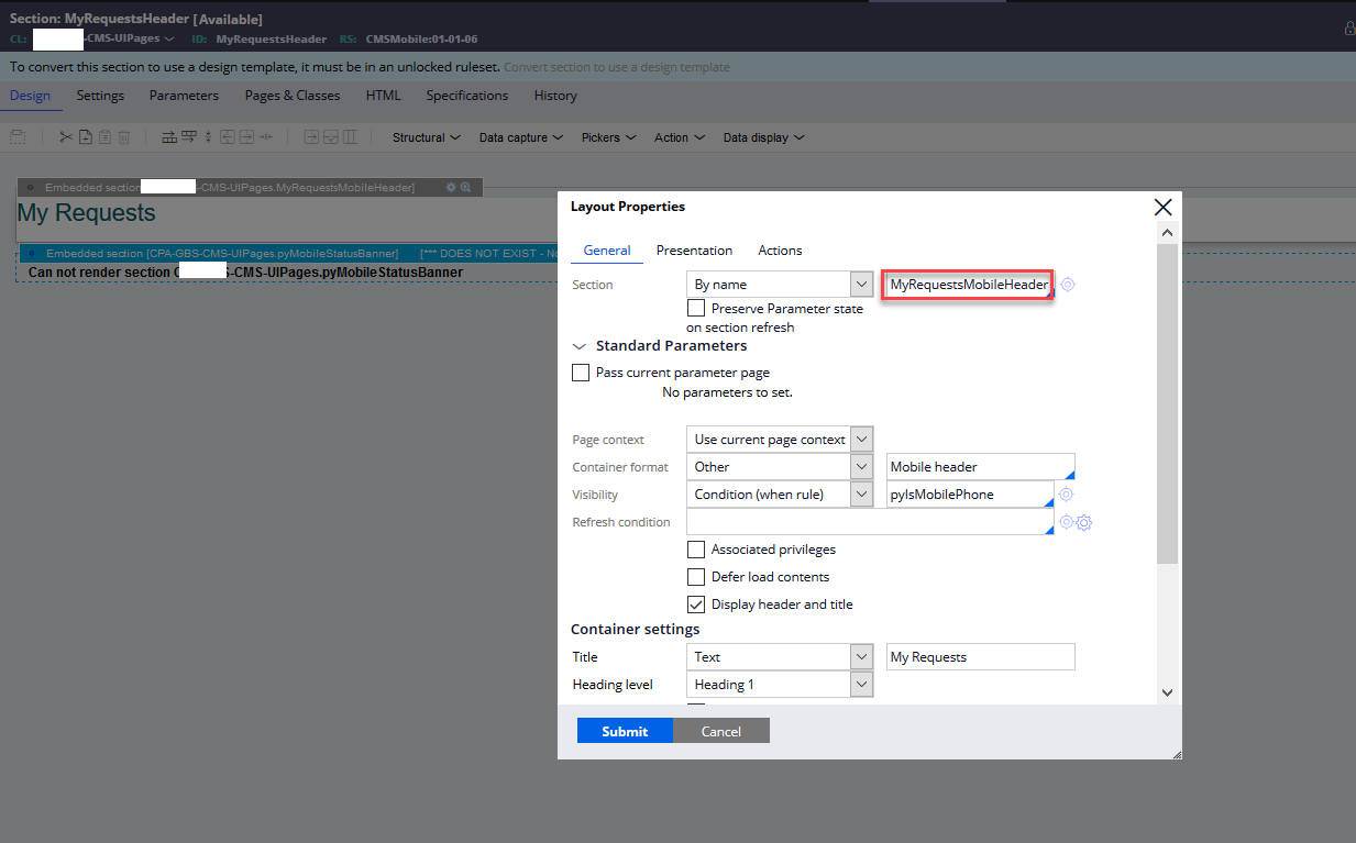
Figure 4.6
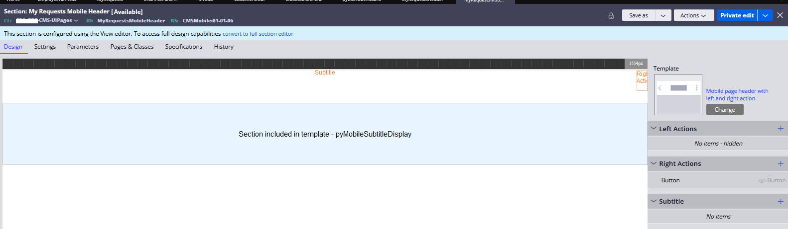
Figure 4.7
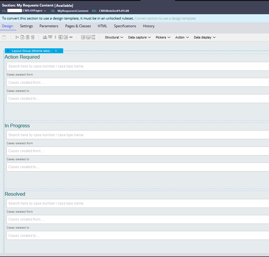
Figure 4.8