Discussion
Pegasystems Inc.
IN
Last activity: 7 Sep 2020 9:43 EDT
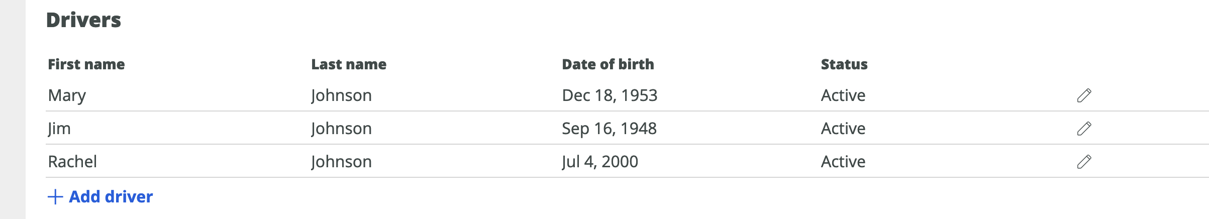
Responsive design for tables with row(inline) edit
We often come across a situation where we need to edit row details in a row. So we fallback to the below design for the same, this is a common scenario. (Observe the pencil/edit icon at the end of row).
 .
.
Now when this is rendered on small screen or mobile devices, this will be viewed as below, which is the default responsive behaviour of any table in Pega (converting row to different blocks with name value pairs)
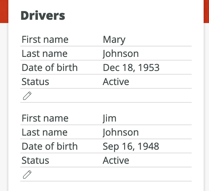
So this is a bad user experience for mobiles as edit/pencil icon is just hanging around, even if it has label edit, still the UX of this has good scope of improvement.
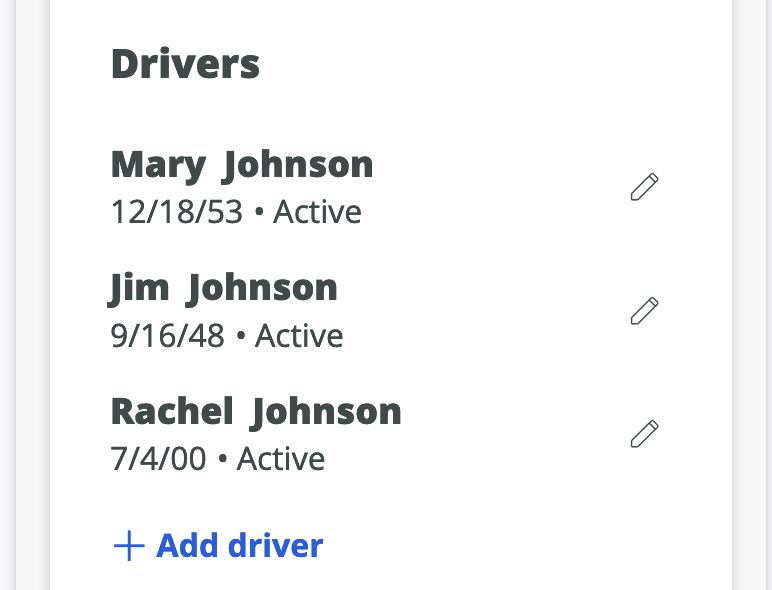
So for cases like these we should re-design the section to use RDL specific to mobile devices (using pyIsMobile when condition and "List item with image, metadata and actions" OOTB template). Then this would look like below. See how intutive and well organised the data is into primary, metadata and actions area.
Hope this article helps, if you have any other questions around this or you had any usability concerns WRT mobile, please submit them over here.